
30 Days of ADM: Day 22 October 21, 2022
Dashboards Ahoy!!!

I am back, it is day 22.
Staying productive is something that everyone wants to do, as such having the right information to hand is always really useful. The thing is everyone is time limited. Working back from that premise, what helps you out?
When you need to look after a service, you need a concise view, with all the important bits flagged for easy access.
You need a dashboard!
The challenge is that there are different areas to look into, can one dashboard do everything?
There should be a Lord of the Rings quote here. Maybe I just need to get on with it!
You have been selected for a training course in Citrix ADM, the goal is to provide you with enough information to be actually dangerous when talking to a customer or client. 30 days is a bit of an arbitrary number, but I am prepared to give you 2minutes of material, can I get 2 minutes of your time?
I have talked about Fleet management, general analytics, security analytics, AI / ML, Stylebooks, Pooled Capacity, instance advisory upgrade, security advisory, Autoscaling, onboarding, RESTful API, CADS self-managed, Service Graph, Web Transaction Analytics, Config Jobs, Network Reporting, SSL Dashboard, RBAC, event handling, config drift and WAF learning.
Today is all about dashboards!
Honestly, what are you talking about?
There are a number of high-level views available in ADM, a series of dashboards, that provide an overview that is context specific. These can be used to see where there might be issues that require further attention.
They typically have a drill-down option, to get further into the weeds.
So what? What problem does it solve?
Visibility of criticality, what do I need to address right now as it is affecting service? Also, where might we be exposed?
Who would be interested in this?
Almost any customer uses a few different NetScaler appliances within their infrastructure hosting services in several DC’s. That’s everyone, right?
How many dashboards?
When you sign into ADM, the default view gives you four widgets/dashboards on one page. It sounds like a lot, but it is very concise. Rolling down the page with a mouse gets you all the important flags. Each of these has a number of links to drill down intomore details based on the status. Colours are used to draw your eye to specific warnings. These pictures are from a demo system, warnings make for better demosit seems!
Top-level view:

Further down the same page, you get these three:
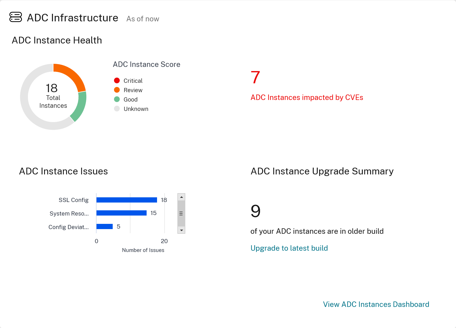
Again, we see that this environment has some CVE’s that need addressing. Very useful, plus there is a link to jump directly to the NetScaler instance view.
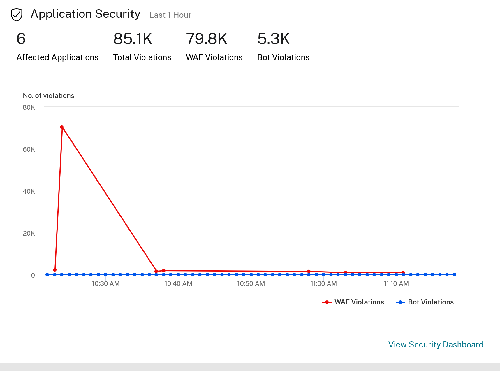
Again links here allow you to jump into the application security view, who is trying to break in, and what are they attacking.
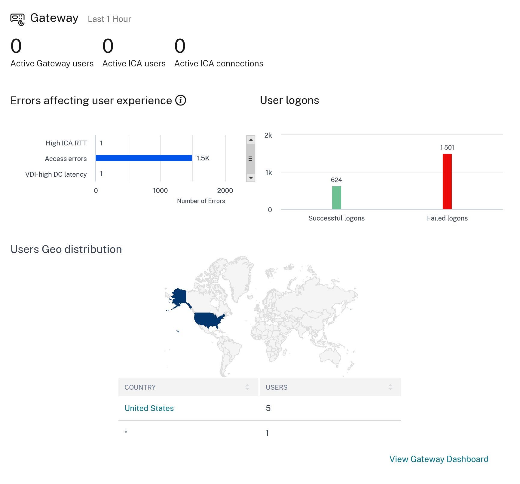
The last widget in the main view covers the NetScaler Gateway, who is accessing the gateway, and from where. Some heavy usage from Alaska?
Time intervals
The dashboards all are time linked, this allows the admin to choose a shorter or longer period to revise the a view. They can be
1. 1 Hour
2. 1 day
3. 1 week
4. 1 month
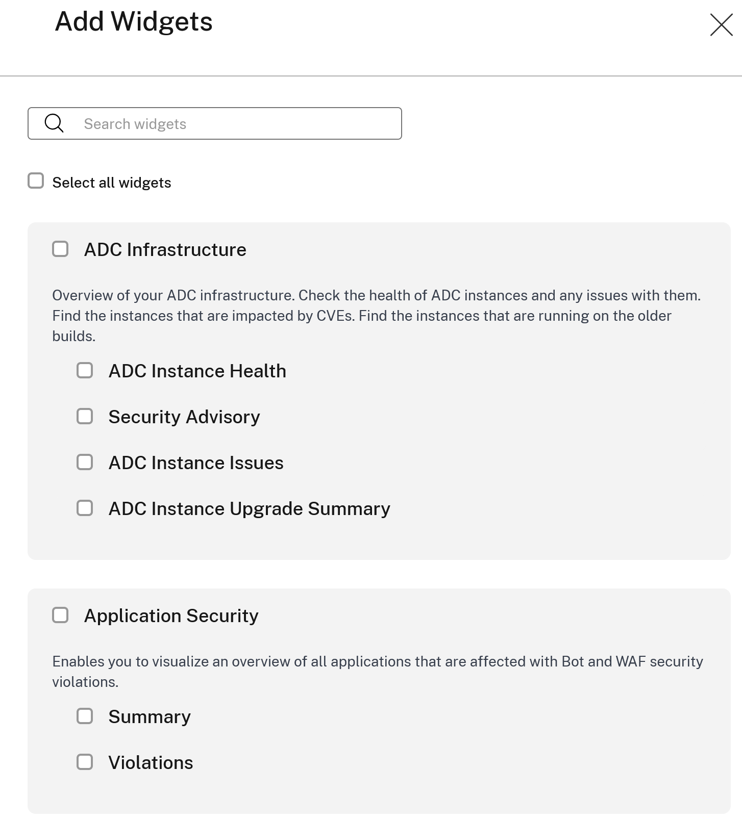
Dashboards/Widgets
The main view is customizable, so you can choose how much information is shown on each view. Click on the top right
Summary
Having ADM show concise status in one view is pretty awesome. It’s funny, this is a given for most clients. Insight into what the current status is can be very useful, as even if you are not the most skilled person in a team, it is quite easy to see when there are things that need fixing. Which if not addressed will affect service.
All of this will help you stay on top of your environment. With tools like this, you can save time and ensure that you get back to high-value tasks.
Ultimately, it is another killer feature that is enabled with ADM service.
It is free too.
What’s not to like?